
A self-initiated web app I designed and built solo — a personal planner with genuine end-to-end encryption, where every task, recurring routine, and quick-captured note stays private by architecture, not policy.
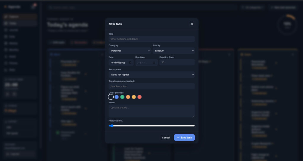
Daily Agenda is a personal planner built around one non-negotiable: the server that stores your tasks should never be able to read them. Everything — tasks, recurring routines, quick-captured notes — is encrypted client-side before it ever leaves the browser.
I owned the project end to end: problem framing, information architecture, UI design (built directly in code), full-stack engineering, encryption architecture, and ongoing testing through real daily use.
Product Designer · Front-End & Full-Stack Developer
Solo project
Web (React + Supabase)
Ongoing
React, Vite, Supabase, Vercel
Genuine privacy & everyday reliability
Most to-do apps ask you to trust a server with your plans, and call it secure because it’s ‘encrypted at rest’ — a guarantee about the company’s compliance checklist, not about what they can actually read. Layered on top of that is a more everyday failure: recurring tasks that duplicate or don’t fully delete, unfinished tasks that vanish instead of carrying over, and day boundaries that quietly flip before actual local midnight. Both problems erode the same thing — trust that the planner will do exactly what it says, every time.
Clear objectives from day one — framed as verifiable engineering and UX benchmarks rather than growth metrics, since this is a private, personal-use tool with no analytics.
No primary user research was conducted — this started as a personal tool, and I’m upfront about that. What I did do was an informal competitive review: checking how Todoist, TickTick, and Lunatask actually describe their security posture, not just assuming. The takeaway was consistent: nearly every mainstream to-do app treats security as a server-side guarantee — encrypted at rest — not a promise the provider itself can’t read your data. Lunatask is the one real exception, but it asks you to adopt an entire life-tracking system to get there.
Since this is a solo, personal-use project, only one persona is backed by real, validated use. The other two are informed hypotheses based on the market and the app’s feature set — not confirmed through interviews.
A privacy-conscious professional who mixes hard scheduling with personal notes and doesn’t want that content sitting in plaintext on a third-party server.
Handles client details or financial notes alongside regular tasks; doesn’t fully trust mainstream SaaS to-do apps with that content.
Blends task tracking with informal daily notes; wants a fast “just capture it” entry point instead of a rigid task form.
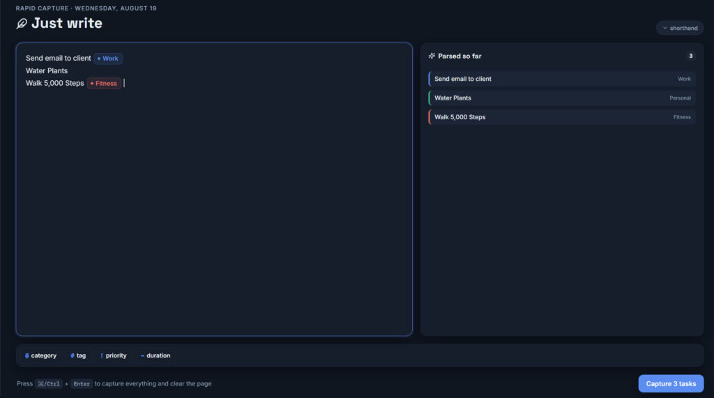
The core flow — quick capture — was designed to remove friction at the exact moment someone thinks of a task.
Types loose text the moment a task comes to mind — no form, no dropdown.
@category and #tag shorthand gets parsed into a structured task automatically.
The task lands in the right category card on Today, ready to act on.
Everything is encrypted client-side before it’s ever sent anywhere.
Navigation is organized around time horizon — Today for the immediate view, Monthly for the broader one — with categories as the organizing layer inside each: Login, Today, Monthly/Calendar, Quick Capture, and Settings.
— Core insight from competitive research & daily use
The UI is a hand-built design system — no CSS framework — with light and dark themes both driven off CSS variables. Building every component by hand kept visual choices tied to how the app should feel to use daily, not to what a component library defaults to.
The shipped app pairs a Today view organized into category cards with a Monthly calendar, non-destructive task carryover, recurring tasks that generate and delete correctly, drag-and-drop reorganization, and a fast quick-capture flow — all wrapped in a hand-built light/dark UI.
Underneath, genuine client-side end-to-end encryption (AES-256-GCM + PBKDF2) means none of it is readable by anyone but me, deployed through a two-branch pipeline so nothing ships without a check first.
Accessibility hasn’t had a formal audit yet, and I want to be direct about that rather than overstate it. A few things are already in place by design — light/dark themes for different lighting and visual comfort, standard semantic form elements, and proper autocomplete attributes so password managers can fill the passphrase field.
Zero server-side visibility into data, enforced architecturally, not promised in a policy.
Recurring tasks, carryover, and categorization behave correctly under real daily use.
The clearest proof point — it replaced the apps I didn’t fully trust, and I still use it every day.
There’s no adoption or engagement data to report — it’s a private tool with no analytics, by design. The impact is that every bug in this case study was found and fixed through real use, not a test environment, and it’s still the planner I open every day.
I turn complex problems into products that actually work — end to end. Let’s talk about yours.