Peacemade Craft: designing an art brand's online store from the ground up.
A self-initiated WordPress + WooCommerce shop I designed from the start to launch an independent art brand online — selling original artwork, handling commission inquiries, and establishing professional credibility from day one.
Solo
Strategy → Launch
3
Core personas
8
Nav destinations
WP + Woo
Platform
Overview
The short version
Peacemade Craft is an independent art brand. I set out to design its online store from the start — a dedicated place to browse original work, buy a piece, and request a commission, built to give the brand a professional home as it grew.
I owned the project end to end: brand strategy, information architecture, UX writing, visual design, and full WordPress/WooCommerce implementation.
Role
UX Designer · UX Writer · Website Builder
Team
Solo project
Platform
WordPress + WooCommerce
Timeline
Phased — plan to launch
Tools
WooCommerce · Photography · Image editing
Focus
Credibility & product discovery
The problem
Launching a credible shop from day one
Designing the store from scratch meant solving four things at once: establishing professional credibility for first-time visitors, creating a clear path to purchase, making custom commissions easy to request, and communicating the artist’s identity consistently — all while feeling trustworthy enough for someone to buy original art from an independent maker.
Goals & success metrics
What the site had to do
Clear objectives up front, with metrics defined to track once the shop is live.
Build credibility that reassures first-time buyers
Create an obvious path from browsing to purchase
Make commission requests simple and inviting
Communicate the brand's artistic identity clearly
Metrics to track
Shop page visits
Product detail views
Add-to-cart rate
Completed purchases
Commission inquiries
Newsletter signups
Returning visitors
Research & discovery
Learning what art buyers actually need
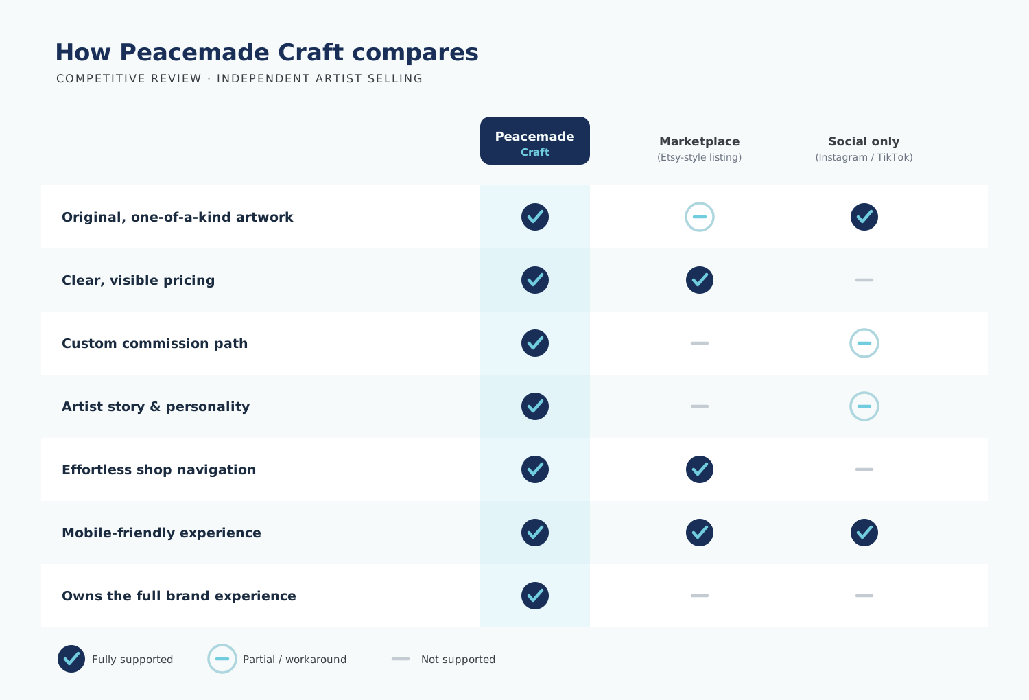
I reviewed competing independent-artist sites, mapped the e-commerce flow, and pressure-tested navigation and readability. The takeaway was consistent: buyers arriving from social discovery value product clarity, prominent imagery, a sense of the artist’s personality, and reassurance that custom work is possible — with navigation that never makes them think.
Competitive review
Content hierarchy planning
E-commerce flow mapping
Navigation planning
Visual exploration
Responsive review
Readability checks
User personas
Three people I designed for
M
Maya
Art Buyer
Wants affordable original artwork with clear photos, visible pricing, and enough trust signals to feel safe buying.
J
Jordan
Commission Client
Needs style examples, confirmation that custom work is available, and an easy, low-friction way to reach out.
T
Taylor
Social Follower
Discovers the artist on YouTube, Instagram, or TikTok and needs a clear jump from social straight to shop or subscribe.
User journey
From discovery to purchase
The homepage was sequenced to move a social visitor toward trust and action, one step at a time.
Discover
Arrives from a social post, curious but unsure the brand is legit.
Orient
Hero introduces the brand and location; artist intro builds a human connection.
Explore
Featured collection and product grid make artwork easy to browse.
Act
Clear CTAs to buy, commission, or subscribe — plus trust signals to close the gap.
Information architecture
A structure that never makes you think
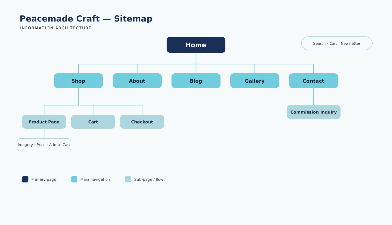
Navigation prioritized the destinations buyers reach for most, with search and cart always in the header. The homepage flows from announcements and nav, into the hero, artist intro, featured collection, trust indicators, subscription prompt, and a footer with newsletter signup and social links.
Guiding principle
Buyers arriving from social don't want a catalog — they want to feel the artist is real, and buying is safe.
— Core insight from the competitive & content review
UI design
Calm, spacious, and built around the art
The visual language uses deep navy for trust and structure, a soft sky-blue as the single accent, and light-sky tints for gentle dividers — letting the art carry the color. Generous white space and large imagery keep the artwork the hero; rounded buttons and a high-contrast footer keep actions obvious.
Navy
Structure & trust
Sky
Accent
Light Sky
Dividers
Paper
Focus on art
Final solution
A storefront that does the whole job
The launched site pairs a welcoming homepage hero with clear shopping and custom-order CTAs, a WooCommerce catalog with strong imagery and visible pricing, a featured product grid, and an artist bio that carries the brand story.
Gallery and blog give the work room to breathe, while newsletter signup, social links, contact info, and header search + cart round out a complete shopping experience.
Accessibility
Built to be usable by everyone
Accessibility was part of the design, not a pass at the end.
Clear CTA buttons
Strong nav contrast
Visible Pricing
Header Search
Keyboard Navigation
Descriptive alt text
Responsive Design
Results & impact
From concept to a real business foundation
Professional presence
A credible brand home that reassures first-time visitors.
Centralized storefront
One place for products, commissions, and inquiries.
Better discovery
A visual product grid that makes work easy to find and buy.
Beyond launch, the site sets up future growth — newsletter and social integration support ongoing marketing, and a defined set of metrics gives the brand a way to measure what’s working as it scales beyond social platforms.
Skills demonstrated
What this project shows
UX strategy
E-commerce design
Legible product imagery
Content hierarchy
Brand storytelling
Keyboard Navigation
Visual Design
Responsive Design
WordPress/WooCommerce
UX writing
digital strategy
Like what you see?
I turn complex products into clear, human experiences that ship. Let’s talk about yours.